Visual Hierarchy: How to analyze a UX design heatmap
Step 1: Check the Clarity score
The Clarity score is a metric indicating how cluttered vs. clear your image or video is in terms of visual attention. High cluttered designs negatively impacts the task performance of your users/viewers and obstructs them from reaching their goal. Whether this is to buy something on a website, or find certain information, or understand the main message of any video.
Brainsight instantly scores a design for clarity in an objective way, providing a rating between 0 to 100 where 50 represents the average image or video. A score of 0 indicates an extremely cluttered and busy visual, whereas a score of 100 means your visual is extremely clean and clear.
Generally speaking, cleaner and clearer designs tend to be more successful than cluttered designs. Aim for higher than average Clarity scores, without compromising content. Clarity is important. If your content is too cluttered, you may be losing your visitor's attention. Cleaner, clearer designs make it easier for customers to find what they’re looking for, and reduces their cognitive load. Below I will guide you to tips on how you can improve a website with a low clarity score, but first let me show you some examples.
Example 1: low clarity website (<40):
Website: www.nike.com
Industry: Lifestyle
Clarity score: 35/100


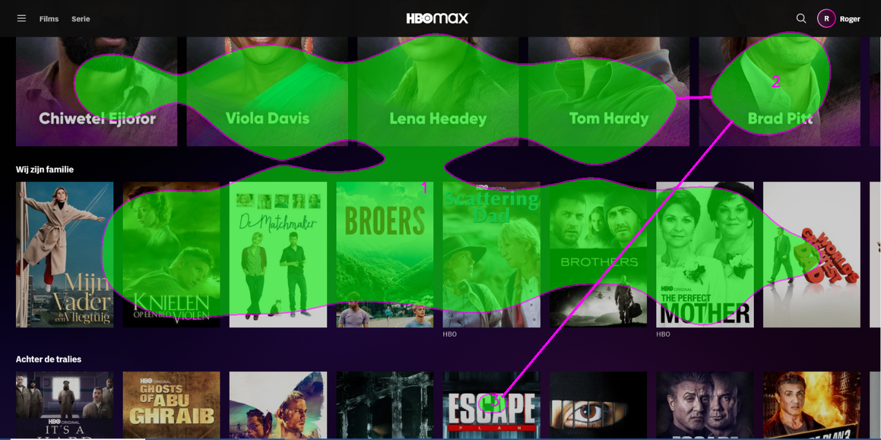
“Because Nike uses a composition of pictures of products and people, you see that the attention is getting scattered. There is not one or two clear focus points where the user should look. In the peekthrough heatmap you see very well that the attention is also quite extended from left to right on the page. This makes it harder for the human eye to quickly focus on the elements they think are important.”
Example 2: high clarity website (>60):
Website: www.apple.com
Industry: Computers, electronics & technology
Clarity score: 68/100
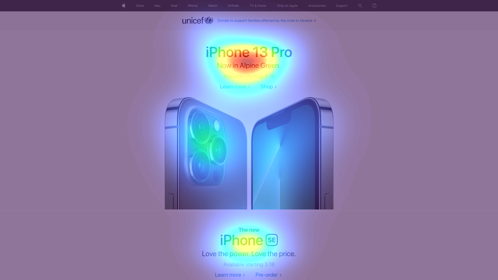
Apple has three clear must see elements on their homepage.
- The title of their latest product with two CTA’s just below.
- A product image
- The title of another product, which indicates to the user they can scroll down to read more on this page.
Also the peekthrough shows very nicely the users eyes can move in a vertical direction down the page, while making sure that he user sees all the info that they show. Brilliant.
As you might have already concluded yourself, you can have a very high clarity score, but this doesn’t always mean that this is a good thing. In some cases the hotspots are actually not covering the elements that you want the user to see. In this case there are clear focus points, but they are actually distracting. That’s why in the next step, we will deep dive in the two heatmaps.
Step 2: Check the heatmaps
“To have the right elements attract attention, is maybe even more important than the clarity of your design.”
That’s why you will need to take the following steps in analyzing the heatmap and peekthrough heatmap:
- Identify the attention-grabbing elements on your design. These are the elements that have hotspots, and/or are visible in the peekthrough heatmap. Write them down.
- Identify the elements that do not attract attention, but are important for the user. These are not visible in the peekthrough heatmap. Write them down.
To give you some guidance, users on a page are looking for a couple things. So if you want to start from scratch, try to find these three elements, and see if they attract attention or not. These elements are the ones telling the user:
- 'what' the page is about. Tell about your product or service in a few words. Show visuals/photos/icons/graphics to support.
- 'why' the visitor should stay on your page, like USP's or product advantages.
- 'where' the visitor should go next, like your main CTA or form.
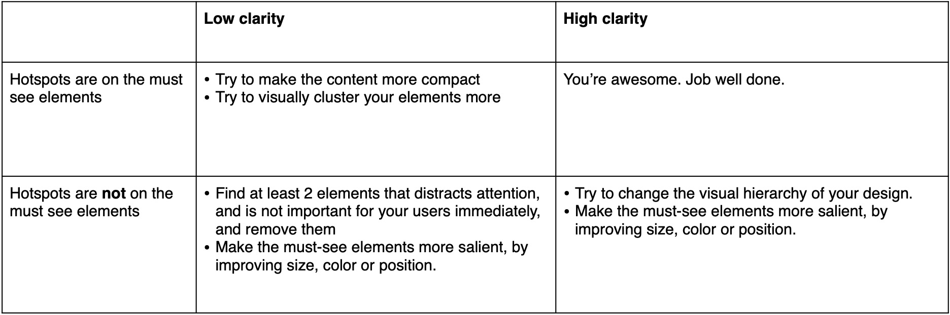
If (some of) your attention grabbing elements are not important, then consider removing them from your design, changing position or size. These distract attention from elements that you consider as must-see.
If your must-see elements don’t attract (enough) attention, then consider making them more salient, by improving size, color or position. Note that, if unimportant elements are removed, automatically other elements will grab more attention.
I’ve written down some guides in an overview below:
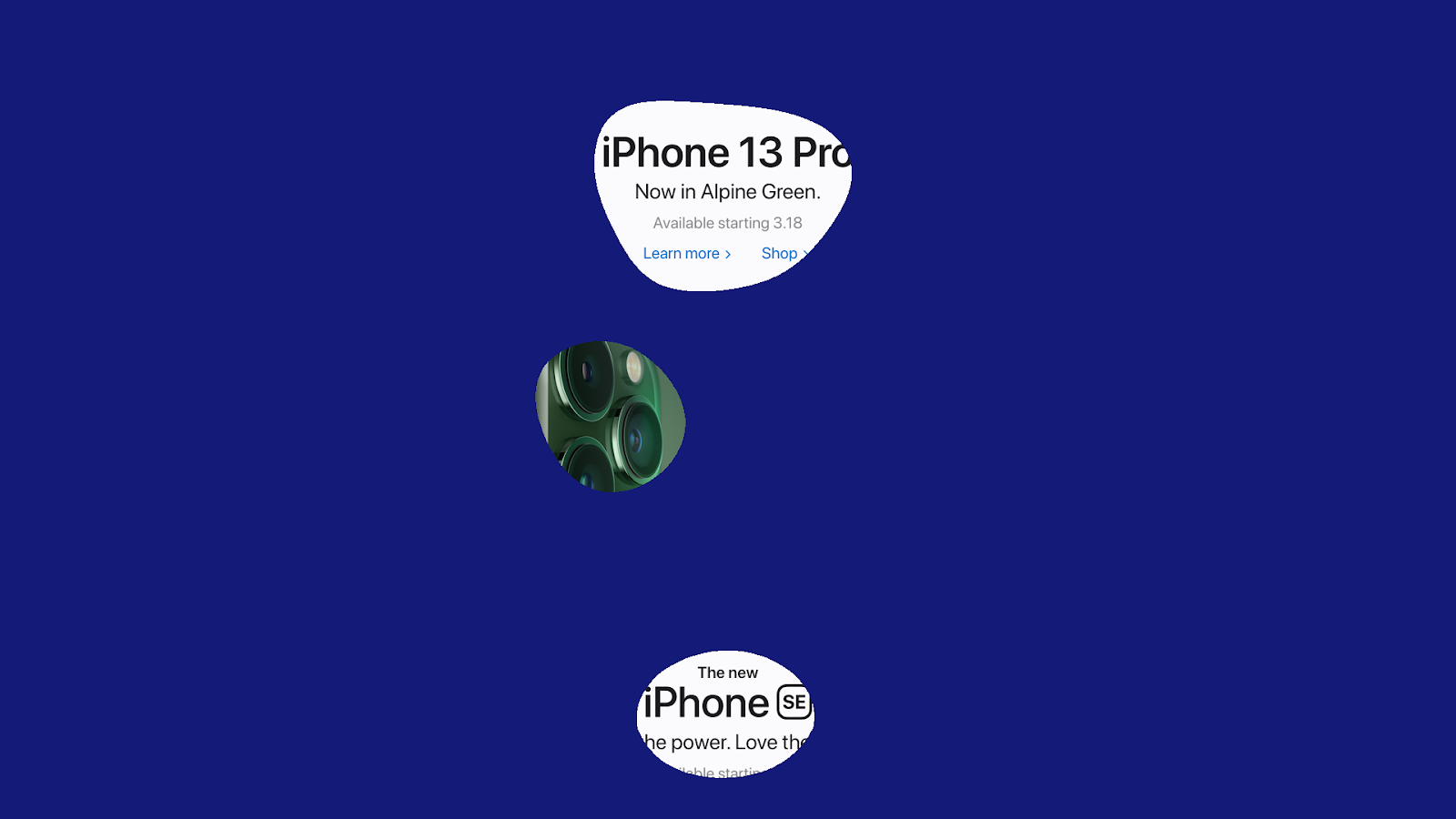
Step 3: check the areas of interest:
The areas of interest are the boxes that you can draw on top of your design to calculate the percentage of attention that goes to that specific area. Below you see an example of the nike.com website with two areas of interest:
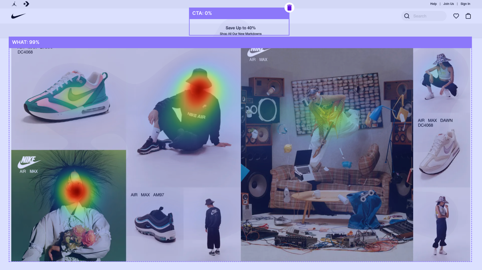
As seen before, this design has a low clarity (35/100), which means that the attention is scattered. Also the areas of interest show that the CTA’s don’t get much attention (~0%) and in contrast, 99% of the attention is going towards the pictures.
Our best practices conclude that if your main CTA’s have 3% or more attention, it is considered good. As an example, on apple.com heatmap above, the CTA’s get around 2%. That is because the buttons are visually not that much different from the text around it, just the color.

If your main CTA gets less than 3% attention, then consider making it more salient by changing the size, color or position.
As a last note, I would like to mention that in some cases a very high clarity score is not feasible. If you’re designing a page that shows your terms and conditions, there might not be a good way to do that in combination with a clear design. But that’s okay! If you’re focusing on pages that deserve your attention, then follow these steps above and you will definitely find ways to optimize your designs, or to confirm that your designs are on par.
Want to learn more about Clarity and how to interpret the scores? Read our article "Why visual clarity is a make or break factor" or see the How-to section on dealing with Clarity scores.

.mp4%20-%20Heatmap.jpg)
