The Gaze Cueing Baby Grew Up to become... Brad Pitt!
From Baby to Brad Pitt: Designing ads effectively for Gaze Cueing
For more than a decade, one neuromarketing image has travelled effortlessly through marketing, UX, and advertising circles: the famous Gaze Cueing Baby.
This concept was popularised by James Breeze in 2009, when his experiment clearly and convincingly showed how attention follows gaze once it has anchored on a face. When the baby looked at the copy, viewers followed. Clean, intuitive, and grounded in live eye-tracking research, it became one of the most recognisable illustrations of gaze cueing ever shown to the industry.
Over time, Gaze cueing was gradually absorbed by the UX- and Advertising Industry as a universal lifehack: make a model look at the logo, and people will follow. This was not Breeze’s doing, but a result of how the industry chose to focus on the outcome, rather than the mechanism that produced it.
In this article we explain what the mechanism of Gaze Cuing is, and, more importantly, once understood, how to apply that effectively in advertising or web design. It is also a summary of our extensive article and technical case-study (for those interested in the science, read the full Gaze Cueing case-study here).
What Is Gaze Cueing in Modern Advertising?
For those less familiar with the neuromarketing principle of Gaze Cueing: this refers to the tendency of viewers to follow another person’s line of sight. Under the right conditions, it can steer viewers toward i.e. a logo, copy, products, or calls to action.
With today’s complex designs and the availability to predictive (AI) attention tools, we can move beyond the key findings of the original experiment and focus on its phased attention process, to understand how it works and to be able to apply that knowledge to better designing and Ad/UX effectiveness.
How the baby grew up to be Brad Pitt
The original baby demonstration worked perfectly to prove the Gaze Cueing principle. It was designed for that with clear design-elements: one face, a sparse, light background and a distinct title for the copy. Viewers could smoothly shift attention from one salient cue to the next when the baby’s view changed (towards the viewer or the copy). What it did not (have to) show -or the industry forgot- was what happened during the Gaze Cueing process. Or how it works in a visually complex environment.
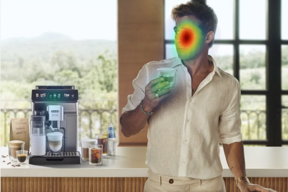
Therefore, we used this contemporary ad. And why not choose ‘that other guy’ who also represents coffee (machines) as a brand ambassador?
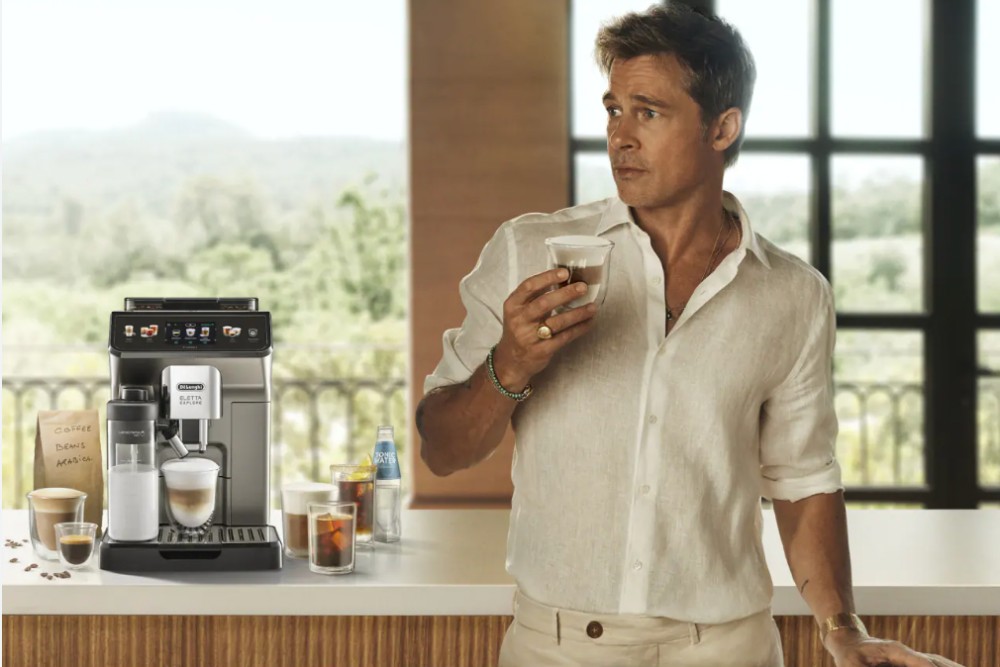
In this creative, we see Brad Pitt, enjoying his De’Longhi-produced coffee and stare at... what exactly? (or is it a Zen-moment with a coffee in his nothing-box?). In any event, it’s an ideal baseline ad for instant attention and intuitive viewing experimentation, testing it with predictive (AI) eye-tracking.
What will happen to viewers' attention when we add the De'Longhi logo to it, and create several variants, including different logo positions? We’ll show you, but not before explaining the different phases of attention that are important to understand how instant attention effects viewing behavior.
What needs to be in place for Gaze Cueing to work: a Phased Attention Process
When looking closely at how attention unfolds, a simple pattern emerges. Before attention can be guided, it first needs focus: stopping power and stabilizing a viewer’s gaze. After these prerequisites, gaze direction will naturally follow. Seen this way, gaze cueing operates in two phases.
Understanding this matters, because complex creative environments come with distractions, competing with attention and hindering visual, and, as a result, harder cognitive processing, which in turn impacts (brand) recognition and memory. By simply putting a person in a design and have her or him look at your brand, doesn’t automatically trigger the Gaze Cueing effect. It requires a balanced design.
How to build and quickly validate this balance is built on the attention phases.
Phase 1: anchoring attention (design for stopping power)
The first phase is how attention enters a visual scene and how it is subconsciously structured by the viewer. This happens before giving it meaning or triggering intention. This is part of a mandatory, intuitive scanning process, where we, as humans, are programmed to scan the environment (as part of our survival brain). Being strongly attuned to other humans, faces play a special role here. They are detected early, efficiently, and without the need for semantic interpretation.
The initial stopping power (anchoring) and initial visual structuring is the cornerstone of attention and first building block of Gaze Cueing. If attention doesn’t anchor because a design is cluttered, visually noisy, or poorly structured, there is no stable starting point and Gaze Cueing cannot compensate for this.
Phase 2: guiding attention
After attention has anchored, the next layer of processing emerges, where viewers begin to give meaning to that they see. They recognise expressions, infer intent, and understand where someone is “looking”, which is the trigger for gaze direction to influence where attention moves next.
You may forget about the science, but remember that attention starts subconsciously and that the brain needs time to understand what the eyes are trying to show it. When digested, making its way to engagement, viewers are primed by (neuro)marketing principles, including Gaze Cueing, of which the foundation was already laid in Phase 1.
Why Brad Pitt Makes a Good Case
Let’s explore this in the Brad Pitt × De’Longhi creative. Note the initial stopping power here (the face) is not about being a celebrity; as mentioned, that interpretation comes later. We like this creative because it reflects how modern advertising is built: cinematic imagery, strong aesthetics, multiple plausible focal points, and real brand placement decisions.
We used 3 x 3 versions in the case-study:
1. Baseline: Brad Pitt looking left (his right), without logo placement
2. Variant A: Brad Pitt looking left, logo placed on the left
3. Variant B: Brad Pitt looking left, logo placed on the right
These versions were also mirrored (Pitt looking the other way; these variants are covered in the technical case-study), to see what happens with the positioning and natural viewing order. Everything else remained identical.
How does the attention redistribute when brand elements are introduced, without turning the creative into an artificial gaze-cueing demonstration?
What happens when the Logo is introduced
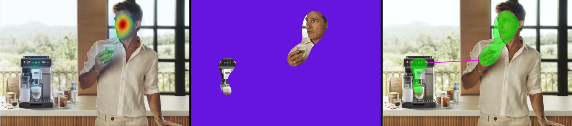
In the baseline version, attention behaves predictably: the face anchors early attention, the product receives secondary focus, and the scene remains visually stable. This is Phase 1 functioning as expected. When the logo is introduced, something interesting happens.
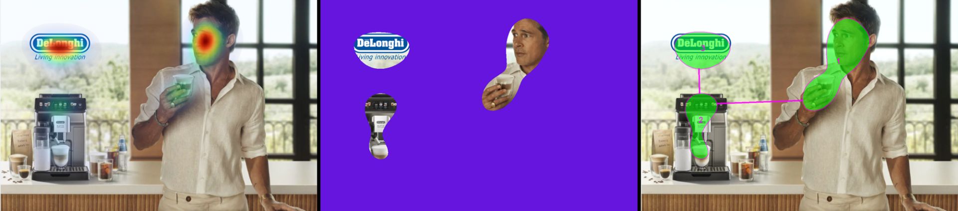
If the logo is placed within the natural scan path, attention does not fragment. Instead, it becomes more structured. The face remains the anchor, but the logo is naturally picked up in the sequence, and the product stays integrated within the same attentional flow. Apart from Gaze Cueing, this is golden for the advertising impact: make a connection with the face (later on emotional connection), anchor the brand, followed by the product. Even if the person decides to ignore the ad, these three key elements were immediately anchored in less than 2 seconds.
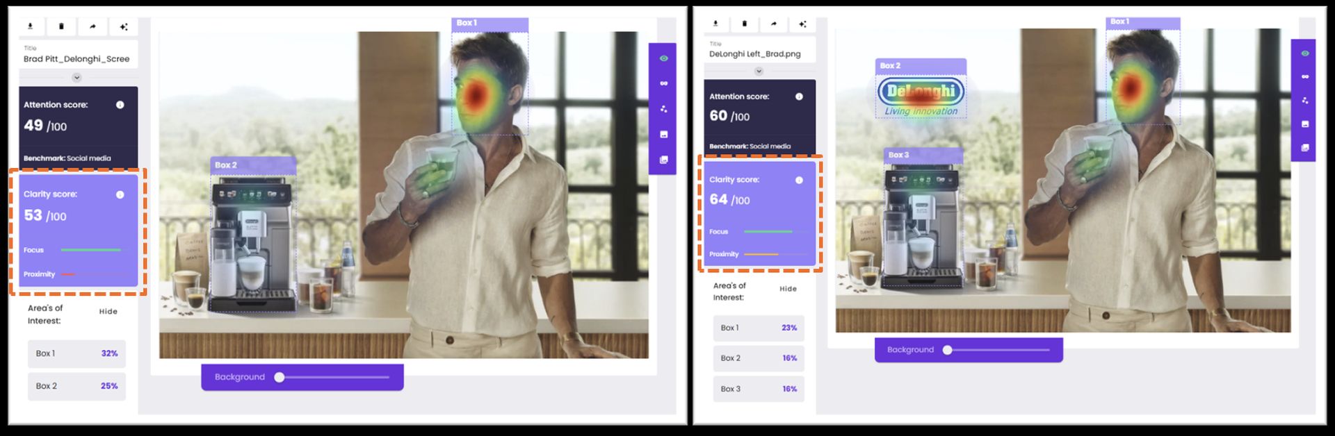
The improvement of the ad can also be concluded by looking at Visual Clarity: attention hotspots are more predictably connected, giving the ad a higher Clarity Score. The composition becomes easier to process, not harder, as the viewer’s (still subconscious) scan path follows a natural flow with smaller steps, opposed to the baseline where one have to scan a larger area to capture the salient design-elements.
This is an important insight because gaze cueing relies on perceptual ease. If attention is overly fragmented or pulled too early toward secondary elements, the visual system must work harder to stabilise the scene, weakening the conditions under which directional cues can exert influence.
“Less, it turns out, is not always more. Balance is.
Taken together (with the other variants from the case-study), the AI heatmaps, predictive gaze plots, and clarity metrics show a consistent pattern. Attention is reliably anchored by the face, remains structured as brand elements are introduced, and forms a coherent scan path. Phase 1 therefore establishes the perceptual conditions under which gaze cueing is known to occur in later phases of processing.
A UX Parallel: when Gaze Cues fail (and why)
This two-phase logic applies just as strongly to UX.
Consider an onboarding screen with a friendly avatar “looking” toward a primary CTA. If the interface loads with dense copy, competing buttons, and visual noise, users scan erratically (imagine your eyes scanning an image for less than two seconds, jumping all over the screen to construct these stimuli). Even if the avatar’s gaze points clearly at the action, attention may never stabilise long enough for the cue to matter.
When the layout establishes a clear anchor first, through hierarchy, spacing, and contrast, the same gaze cue becomes (more) effective. So the Cue does not create attention, it channels it. This brings us to attention-flow design.
How to design for Gaze Cueing (a practical How-To)
Now that you understand the phases of attention, designing for Gaze Cueing does not require any rigid templates or formulas, but just knowing what needs to happen first and to understand what may trigger the viewer’s behaviour later:
1. Establish a reliable anchor. Ensure attention consistently lands where you want it to start.
2. Check Clarity, not just saliency Attention should be structured, not scattered.
3. Introduce brand and product deliberately. Place elements where they extend the scan path rather than interrupt it.
4. Use gaze direction as reinforcement. A gaze strengthens an existing path; it does not generate one from scratch.
Predictive Attention Modelling is particularly useful here. It allows teams to pre-test and A/B testing Phase 1 conditions, before relying on gaze direction, and consider live research to validate outcomes in Phase 2, if campaign budget permits. With today’s SaaS tools, this is no longer something for big agencies or research labs, but can be embedded in a process of iterative testing- and designing for (digital) marketing and UX/CRO teams.
Key takeaway: from Lifehack to Design Method
James Breeze’s original demonstration remains one of the most elegant illustrations of gaze cueing shown to the industry. What has changed is our ability to design for the conditions that make it work.
By realizing that Gaze Cueing not as a universal shortcut, but deconstructing it in a phased attention process, advertisers and UX/CRO teams gain something more valuable than a trick: control over attention flows. Not control over people, but over how attention enters, stabilizes, and moves through a design naturally and intuitively.
Try and experiment with the Gaze Cueing concept and log-in to Brainsight or sign-up for a trial to validate how you're doing.